Product DesignerPride FamilyLaunched

Built 6 Core Pages and Shipped Key Trust Flows for a Web Platform

Designing a coherent, accessible site for an LGBTQIA+ nonprofit, from sitemap through a 32-component design system to a responsive build with working donation and authentication flows.

Team
PM, TPM, 3 Designers, 3 Engineers
Timeline
18 weeks
Tools
Figma, WordPress, Spectra, Donorbox, HTML/CSS
Platform
Website
Built 6 Core Pages and Shipped Key Trust Flows for a Web Platform
Overview

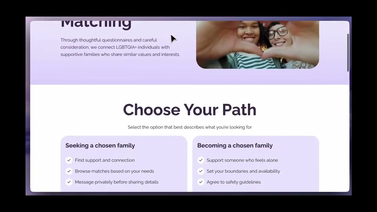
A coherent digital home for Pride Family

Pride Family helps LGBTQIA+ adults find chosen family through a matching program, while offering resources and a clear way to support the mission through donations. The site needed consistency, clearer pathways, and working fundamentals so visitors could understand the program quickly, take action with confidence, and get help without hunting. I served as lead designer, built a 32-component design system to standardize the experience, and collaborated closely with the PM and TPM on scope and priorities.

7
Core Pages Built
End to end
32
Component System
Design system built
6
Usability Participants
9 revisions shipped
WCAG AA Compliant
Responsive on all devices
Target Users

Two distinct users with very different needs

01
Primary User

LGBTQIA+ Adult Seeking Connection

Someone arriving with urgency, looking for community, safety, and resources without barriers.

Goals and Needs
  • Understand what Pride Family offers quickly
  • Find resources without hunting
  • Learn how matching works and what to do next
02
Secondary User

Supporter Who Wants to Donate

A motivated donor who needs to trust the organization before committing funds.

Goals and Needs
  • Confirm the org is legitimate
  • Complete a donation with confidence
  • Receive a clear confirmation moment
Constraints

What shaped the decisions

Every design decision ran through these four constraints. They weren't blockers, they were the brief.

01

Tight timeline with a cross-functional volunteer team

02

WordPress constraints, so patterns needed to be maintainable by non-technical staff post-launch

03

Sensitive domain where clarity and safety matter more than novelty

04

No analytics at launch, so usability testing was the only signal

The Problem

A site that needed to earn trust fast

The org needed a complete, coherent website that could explain the mission, guide visitors into matching and resources, and support donations without confusion. The TPM initially scoped out the design system as non-essential. I mapped the implementation risk: without a shared component foundation, engineers would build divergent one-off implementations that couldn't be maintained post-launch. The TPM approved a leaner 32-component version (down from 50+ originally proposed) as a minimum viable foundation. Beyond the system, the highest-risk area was trust friction. If login feels unclear, if password recovery is messy, if donation confirmation is vague, users leave.

"What should a user do next, and can they do it without doubt?"

Strategy

Clarity as a design principle, not just an aesthetic

Goal: Ship a complete site that makes the next step obvious for each visitor type

Rather than optimizing for visual novelty, the entire strategy was oriented around reducing uncertainty at decision points. Every interaction decision was filtered through WCAG AA compliance, low cognitive load, and calm motion over animation.

Principles

Make navigation predictable. Clarity beats cleverness.

Consistency is a trust signal, especially for first-time visitors

Reduce decision load at high-intent moments: two primary CTAs maximum per page

Build patterns the team can maintain after the sprint ends

Working Hypotheses

If we clearly explain matching and resources with consistent CTAs, more visitors will take an action instead of bouncing.

If the trust flows feel straightforward, users will finish login recovery and donation completion with less hesitation.

Gallery 1
Sitemap and information hierarchy
Prioritization

What we built, in what order, and why

A complete site creates comprehension. Trust flows protect conversion and credibility. So we standardized first, then shored up the moments where uncertainty causes drop-off.

Built First
  • 32-component design system so every page feels like the same product
  • A single CTA framework, so 'what next' is always obvious
  • Core pages built around that system
Built Next
  • Login redesign
  • Forgot password flow
  • Donate confirmation modal using Donorbox embed
Intentionally Skipped
  • Deep backend rewrites
  • Full content rewrite
Gallery 1
Defining product requirements
Gallery 2
Defining product requirements
Execution

From sitemap to shipped, in eight steps

A lean, structured process where each phase had a clear output so nothing drifted.

01

Site Map and Content Structure

Translated the org's goals into a simple site structure with six pages, then set a consistent layout rhythm so the website felt like one product.

OUTPUT

Clear information architecture and page-level structure for build.

Step 1 image 1
02

Audit and Journey Mapping

Mapped the three highest-intent paths (find chosen family, get resources, donate), then listed friction points where users would hesitate or bounce.

OUTPUT

Prioritized backlog grouped by trust friction, pathway clarity, and conversion moments.

Step 2 image 1
03

32-Component Design System

Built a shared component library covering navigation, CTA hierarchy, spacing, and card logic across 6 pages. The TPM initially scoped this out as non-essential. I made the case that without it, engineers would build divergent one-off components that couldn't be maintained post-launch. The approved version (32 components vs 50+ originally proposed) became the foundation the team could extend.

OUTPUT

A maintainable design system that standardized every page and reduced per-component engineering overhead.

Step 3 image 1
04

Core Pages Build

Created seven pages with consistent navigation, hierarchy, and CTAs. Header and footer consistency, hero structure, spacing rhythm, and button hierarchy built using the component system.

OUTPUT

A complete website with a repeatable template approach.

Step 4 image 1
05

Login Redesign

Redesigned the login page to reduce confusion and make account entry feel clean and safe. Copy, hierarchy, and error handling treated as part of the product experience.

OUTPUT

Redesigned login screen aligned to the site's trust tone.

Step 5 image 1
06

Forgot Password Flow

Designed the full forgot-password path so recovery steps feel obvious and the user is never forced to guess what happens next.

OUTPUT

A clear recovery experience that supports retention.

Step 6 image 1
07

Donation Flow Build

Implemented a donation modal experience using Donorbox so users could donate without leaving context. CTAs consistently placed across core pages. No auto-advancing content, recovery flows that never left users on a dead-end screen, and trust copy placed before action prompts.

OUTPUT

Working modal flow and a donation entry pattern the team can reuse.

Step 7 image 1
08

WCAG AA Compliance and QA

Checked responsiveness, spacing, and legibility across desktop, tablet, and mobile. Verified color contrast ratios, keyboard navigation, and focus states. Delivered WCAG AA-compliant handoff documentation for the engineering team.

OUTPUT

Launched site with accessible patterns and a maintainable structure.

Step 8 image 1
Gallery 1
Mid-fidelity designs
Testing and Iteration

Remote usability testing with 6 participants

Testing focused on first-time comprehension. Could a new visitor understand the mission, navigate to key actions, and complete trust flows without hesitation? The study was exploratory, not statistically powered, and was used as launch-risk reduction rather than conversion optimization.

Method: Remote unmoderated usability testing, 6 participants
Tasks Tested
01Explain what Pride Family does in your own words
02Navigate to matching and describe what you would do next
03Find resources for immediate support
04Complete a donation or describe how you would
05Interpret the login and password recovery experience
06Find how to contact the team
Revisions Shipped
Simplified navigation cues and reinforced primary CTAs on key pages
Improved scannability on resources by tightening hierarchy and clarifying labels
Reduced variation in page sections so users did not have to relearn patterns
Reinforced donation CTA placement based on where users expected it
Consistent back-navigation behavior added across all flows
Simplified resource category labels for faster scanning
Strengthened trust copy placement before action prompts, not after
Fixed dead-end states in login recovery flow
Final WCAG AA contrast and focus-state pass across all pages
Key Findings

All 6 participants navigated key flows without hesitation after revisions were shipped

Users responded well to a clear mission and direct calls to action

Some users hesitated on the resources page when categories were not immediately obvious

Donation intent increased when Donate was consistently visible and not buried

Users trusted the site more when pages shared consistent structure and tone

"The website was easy to navigate so that felt good."

Usability Test Participant

"Uplifting, safe."

Usability Test Participant

"Happy, comfortable."

Usability Test Participant

Gallery 1
User testing insights and iteration changes
Results

Shipped scope, usability evidence, and accessibility compliance

Analytics were not yet available at launch, so results are framed as shipped scope plus usability evidence. The 6-participant study provided directional signal and drove 9 revisions, all implemented before launch.

7
Pages Built
End to end
32
Components
Design system
9
Revisions Shipped
From usability testing
WCAG AA
Accessibility
Compliant handoff
Shipped Scope
32-component design system built and used across all pages
7 core pages created: Home, About, Resources, Matching, Blog, Contact, Ecommerce
Login redesigned for clarity and reduced friction
Forgot password flow designed end to end
Donation modal implemented with Donorbox embed
9 usability revisions implemented before launch
WCAG AA-compliant handoff documentation delivered
Responsive layout verified across desktop, tablet, and mobile
Gallery 1
High-fidelity designs
Gallery 2
High-fidelity designs
Demo

See it in action

Website demonstration

Website demonstration

"Develop for Good has been an amazing partner, helping Pride Family grow and make a real impact."

Michele Ellenberger
Pride Family Founder
What I'd Do Next

If I kept going

These are the highest-leverage moves I'd pursue in the next sprint.

Measurement
  • Add event tracking for Match CTA clicks
  • Track resource outbound clicks
  • Measure donate CTA engagement by page position
  • Track login recovery completion rate
Experiments
  • Test homepage CTA order: Start matching vs View resources vs Donate
  • Test donation CTA placement: header only vs header plus mid-page
  • Test resources presentation: top tasks first vs categories first
Product Improvements
  • Add lightweight resource search or filter
  • Add stronger trust cues near donations: where funds go, privacy note
  • Add a matching pathway explainer that reduces uncertainty in the first 30 seconds
Reflection

The work that mattered most was invisible

Building the full site forced a clear product question: what should a user do next, and can they do it without doubt? The work that mattered most was not visual polish. It was reducing uncertainty at decision points. The biggest wins came from removing friction, not adding features, and building a system the team could maintain after the sprint ended. The TPM redirect on design system scope was the right call in retrospect. Proposing a leaner 32-component version rather than the full 50+ taught me how to make a prioritization case that a resource-constrained team can actually act on. One gap: no post-launch analytics were instrumented, so I couldn't close the loop from usability signals to real conversion data. Next time I'd push for even lightweight event tracking before launch.

When your audience arrives with urgency, predictability becomes kindness, and kindness becomes conversion.

Get in Touch

Let's connect and build something together.

Open to product, GTM, operations, and design opportunities.

© Liana Ngo · 2026Made with intention